For book cover, I used Adobe Photoshop to create the final design. This software is appropriate to create this design because it required me to manipulate two photos and add effect to that made it look like I used water paint to create Mr. Darcy. I created a text effect to help the title stick out from the cover while using a serif font style. My final design does show an advanced working knowledge of Adobe Photoshop and an understanding in the skill to create a book cover.
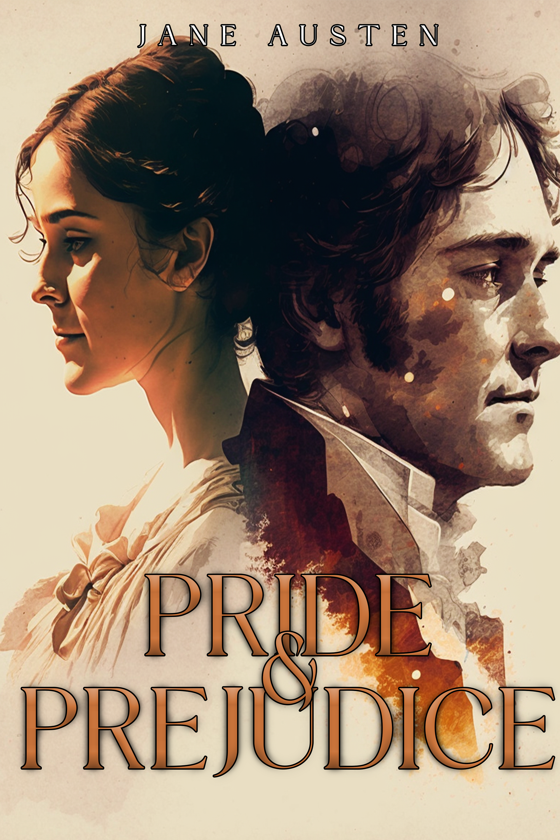
In this book cover, elements of design were used in texture, color, and space. I used space to make sure that the couple would be right in the center of the cover and would align with the title. Principles of design that I focused on were hierarchy and proximity, which can be best seen due to the alignment of the subjects on the cover. When it comes to color, I went a brown and orange palette, different than what would mostly go on a romance cover which is usually pink or blue. I also added the watercolor texture on Mr. Darcy since he plays both the antagonist and protagonist for Elizabeth in the story.
The ethical guidelines were thought of for this book cover. The ideation for this was to reimagine a book cover for the famous Jane Austen book Pride and Prejudice. It is one of my favorite books of all time and I needed a bit more practice when it comes to book cover designing. I thought it was best to place both Elizabeth and Darcy on the cover since they are the main characters on the story. I didn’t get critiques on this cover since I created it for fun and not for an assignment. I did publish it on Behance. My final design does show evidence of skills and attention to detail. The two merged images are in high resolution and are in print-ready, color accuracy, and the layout is in a readable format.